


My Role
UX strategist, User Research, Wireframing, Prototyping, UI Design, Brand Development
Tools
Figma, pen and paper, whiteboard, post-its
Approach
Agile methodology, Double Diamond, Human Centred Design, Design Thinking, Crazy eight
Duration
8 weeks

Introduction
Welcome to my capstone project!
Jewellery has been my passion since I was little. I have been working in the high jewellery industry for 8+ years and heard many comments from clients.
The following chapters will show you all the steps I took to bring BeBespoke to life, and the iterations the app went through from early ideation to be where it is today!
I used the Double Diamond technique to explain the process, with a small summary below. Keep an eye out for exclamations signs, as these are key findings I encountered during the process.
Discover
Problem space
Secondary research
Assumptions
Hypothesis
Primary research
Affinity mapping
Define
HMW
Persona
Experience mapping
User stories & epics
Task flows
Develop
Sketches
Wireframes
User testing
Brand development
UI library
Deliver
Hi-Fi prototype
Marketing website
Discover
Secondary Research
According to research done by Precision Business Insights the UK jewellery market was valued at £3.4 billion in 2021 and is expected to grow at a compound annual growth rate of 13.1% during 2022-2028.
Bespoke jewellery is a popular choice due to the meaningful and personal experience and is especially popular for special occasions such as weddings and anniversaries
-lordoflondon.com
Jewellers are seeing a rise in demand for custom and bespoke jewellery, especially with engagement rings
-toppandigital.com & jewellermagazine.com


The Problem
The number one quoted source of frustration is lack of trust and difficulty in finding reputable jewellers.
This all indicates that customers are interested in bespoke jewellery but do not know where to start or whom to trust.
Primary Research
I interviewed 6 individuals, who had commissioned jewellery either for themselves or for someone close to them. The goal was to understand their pain points and what their experience buying bespoke jewellery had been.
“Concerns over finding a reputable jeweller, process overwhelming”
-Alejandro
“Final piece didn't match expectations”
-Steve
“Is hard to visualise how the bespoke jewellery will look at the end of the process”
-Hannah
“It’s difficult to find and choose a trustworthy jeweller”
-Gloria
Jacob (Male)
Had a frustrating bespoke jewelry experience with a jeweler who was not able to capture his vision and surprised him with price increases. Jacob stays open to trying bespoke again for the uniqueness if the process improves.
Dirlene (Female)
Reused scrap gold to make a bespoke ring but found the distant jeweler and long process impractical.
Darline appreciates bespoke jewellery for its uniqueness and artistry so may do it again if more efficient.
Hannah (Female)
Successfully designed a bespoke heirloom ring honoring her late grandmother with a jeweler she found through word-of-mouth
Hannah suggests more digital tools to aid the process.
Alejandro (Male)
Had a bespoke jewellery experience with a trusted local jeweler, appreciating the meaningful customisation, altough the final piece did not look as he imagined.
Alejandro finds it hard to find a jeweller, unless recomended from somone.
Steve (Male)
First bespoke jewelry experience was disappointing due to the difficulty finding a reliable local jeweler and unmet expectations around budget and design visualisation.
Steve valued the personalisation but advises more trustworthy remote jewellery artisans to improve customer experience.
Gloria (Female)
Had few pieces made with a trusted local jeweler, that was reamoended by her friend.
Gloria appreciated the special designs but wants more realistic renderings, as it's hard to visualise the final product.
Key Insights
Key information from the interviews was organised into an Affinity Mapping split by Pain Points, Motivations/Goals and Behaviours.
This allowed me to identify the key Themes and Insights.

I then focussed on two relevant themes and their insights, as they best reflect the main user concerns.
Design & Customisation
When choosing a jeweller, people want expertise and trust but find it difficult and often rely on referrals from family and friends.
Trust & Expertise
People want unique, personal jewellery to keep forever. They want to be heard during design and see visualisations of the final product before committing.
Discover - Takeaways
My secondary research informed me that a key issue customers face is to trust and find the right jeweller, which my interviews confirmed. The interviews also uncovered problems as they found it both hard to visualise the final jewellery piece or that they received something that did not match their expectations.
This demonstrates how important it is to do user interviews and dig deeper into the problem to get the right solution.
Define
How Might We
With the two themes in mind, I formulated a focused problem statement that will serve as a guide for designing a targeted solution.
How Might We help customers find reputable jewellers, design and create bespoke jewellery while making the process more transparent, creative and accessible?
User Persona
The interview findings provided insights into user challenges, enriching my understanding. I created a persona and experience map to drive my designs for the target users and identify opportunities in which to focus my digital solution.

Experience Mapping

Task Flow
I created a primary and secondary task flow to help Matthew visualise the future design. This enables him to locate a trustworthy and validated jeweller that aligns with his preferred style and see the experiences of other clients.
Primary Task Flow
Customisation


Secondary Task Flow
Find the right bespoke jeweller

Develop
Sketches
In this process, I sketched 3 possible solutions to display how the layout could look like. I then chose then one that felt like the most user-friendly and intuitive.
Here are the final sketches before I moved into wireframing them in Figma.


User Testing 1 & 2
I conducted usability testing in two rounds with 10 users in total, using a clickable prototype and assigning different tasks.
Throughout the process, I recorded user issues and suggestions. The insights learned allowed me to iterate my design and make the right changes.
Then it was time to plot all the changes in a Prioritisation Matrix, from high to low value and high to low effort.
Here are screenshots of the evolution, with Issues in RED & Solutions in GREEN
Version 1
Version 2
Version 3
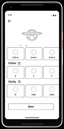
The image changes when selecting different options

The image does not change when selecting the options
Lacking the option to get more information on Colour, Clarity,...
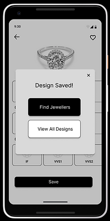
Added a popup indicating the design is saved and give options to proceed
Users like to be able to access all the designs after making one and to have an easy access to find a jeweller
Now there is an option to find more information about Colour, Clarity...
No obvious button to save, just a Heart icon on the top
A save button was added
Version 1
Version 2
Version 3

Users tried to see the profile by clicking on the jewellers rather than the Contact Selected button
The arrow was moved to the top for easier access
Users wanted to see how many people gave stars to the jewellers
Hard to go back as the arrow is at the bottom of the page

When selecting the card, this will bring you to the jewellers profile
Changed the More button for a Message button
Changed the rating style to make it easier to see how many people have rated the jeweller

Version 1
Version 2
Version 3


Found the text too small and hard to read
Did not like that it was a pre-generate message they want to be able to personalise or edit the message before sending
They find this buttons confusing as they are separated from the text
Users want to have the option of selecting different diamonds and see the invoice in a more official way
User can view the invoice in a separate page making this more official looking and clearer and also to be able to choose form different diamonds

Wanted more options, not just accept the quote.
Want the option to attach more photos or documents once in the chat
Develop - Takeaways
User testing is really important. It's a way for UX to see what needs to be improved or modified to make our work user-friendly.
Throughout this project's testing, users raised insightful points that guided key modifications. For example, on the jeweller's profile, everyone failed because they kept pressing the card rather than the More button, as it was intuitive for them to do that. This revealed the need to rework profile navigation and messaging flows.
Conducting multiple rounds proved beneficial as well, since early testers focused on larger issues before later users noticed additional oversights once those initial problems were resolved
Brand Development
With the final flow of screens established, I then thought about the visual identity of the app before creating the high-fidelity prototype.
I thought about several adjectives and made a More A than B that represents my brand identity. This helped me select 5 words that best represent the brand.
After that, I was ready to create a moodboard to capture the essence and a UI moodboad as well to capture the structure and style.
Moodboard

Brand Name
The app has an emphasis on personalisation and uniqueness. The word “Bespoke” embodies those characteristics so I wanted to incorporate that into the name.
Since Bespoke is a common word, I wanted to differentiate the brand further. Adding the word “Be” at the start changed the meaning to a more personal approach.
It feels like a call to action for the user reading it, for them to BeBespoke!
The Icon and Logo were thoroughly tested until the right option was found.

Colour
After finding the right colour palette I used the 60-30-10 Rule and consistently applied it throughout the app. This creates balance and helps the user to navigate with ease. An accessibility test was performed to see if the colours would work together.


Typography
Inspired by the brands in the UI moodboard, I went through multiple iterations of fonts before finding a combination that complements each other and best captures the brand identity.

UI Library
Below are few examples of the UI library to showcase the icons, components and layout design with measurements.
Iconography

Atoms

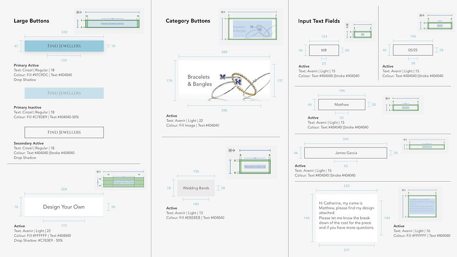
Molecules

Organisms


Develop (UI) - Takeaways
I began with a moodboard featuring dark colours. Despite my efforts, the dark tones didn't complement the wireframe. I instead pivoted toward a different style, opting for a lighter palette to better suit the design.
This showed me that favoured colour combinations might not always align with the intended mood or message, and the need for continual iteration until discovering the perfect match.
Lastly, was the potency of typography in transforming an app's appearance. Persistence in experimentation is essential to pinpoint the typeface that truly embodies the brand.
Deliver
High Fidelity Prototype
All the above, led to the final prototype

Designing Your Own Jewellery
Users can select from a broad variety of jewellery options to design from.
Users have a wide range of options per jewellery and their selections are immediately reflected in the app.
If users want to create a more complex design, they can use the Find a Designer section
My Designs
When the user is happy with their selection, they can save their design.
All designs can then be seen together in one page.


Find a Jeweller
It's easy and fast for users to find an independent trusted jeweller.
They can view their profile and see what other users say about them.
Once the desired one is found, they can message them directly.
Contacting a Jeweller
Upon selecting a jeweller, users can pick a design they've crafted or upload a photo of an item they desire to be recreated.
Next, the jeweller and user message directly for updates comprising photos, videos, and progress reports on the piece until its completion.


Next Steps
User-test the UI for feedback and iterate on the overall app design and colour palette, as there is always room for improvement!
Evolve the designing section further by making all the options available so that the image keeps changing accordingly and being able to see more profiles of the piece.
Add a 3D virtual image so users can try it on once designed.
If the design is too complex, add a provide a Find a Designer section, which follows a similar flow as the Find a Jeweller section and make this service available.
Final Takeaways
This capstone has taught me so much and I have learned many valuable lessons.
-
It is essential to iterate, as you can always improve your design and flow.
-
Your users are a great source of understanding and input.
-
Be agile and flexible in your approach.
-
Good typography and colour palette can revolutionise your app.
-
Even with 8+ years of experience in the jewellery industry, I encountered unanticipated user problems, highlighting the need for continuous learning.
Overall I really enjoyed finding a solution to a problem that I had seen during my career in the jewellery industry and making people's lives easier.